About the Application
Turn your new user experience into a polished, professional tour in minutes.
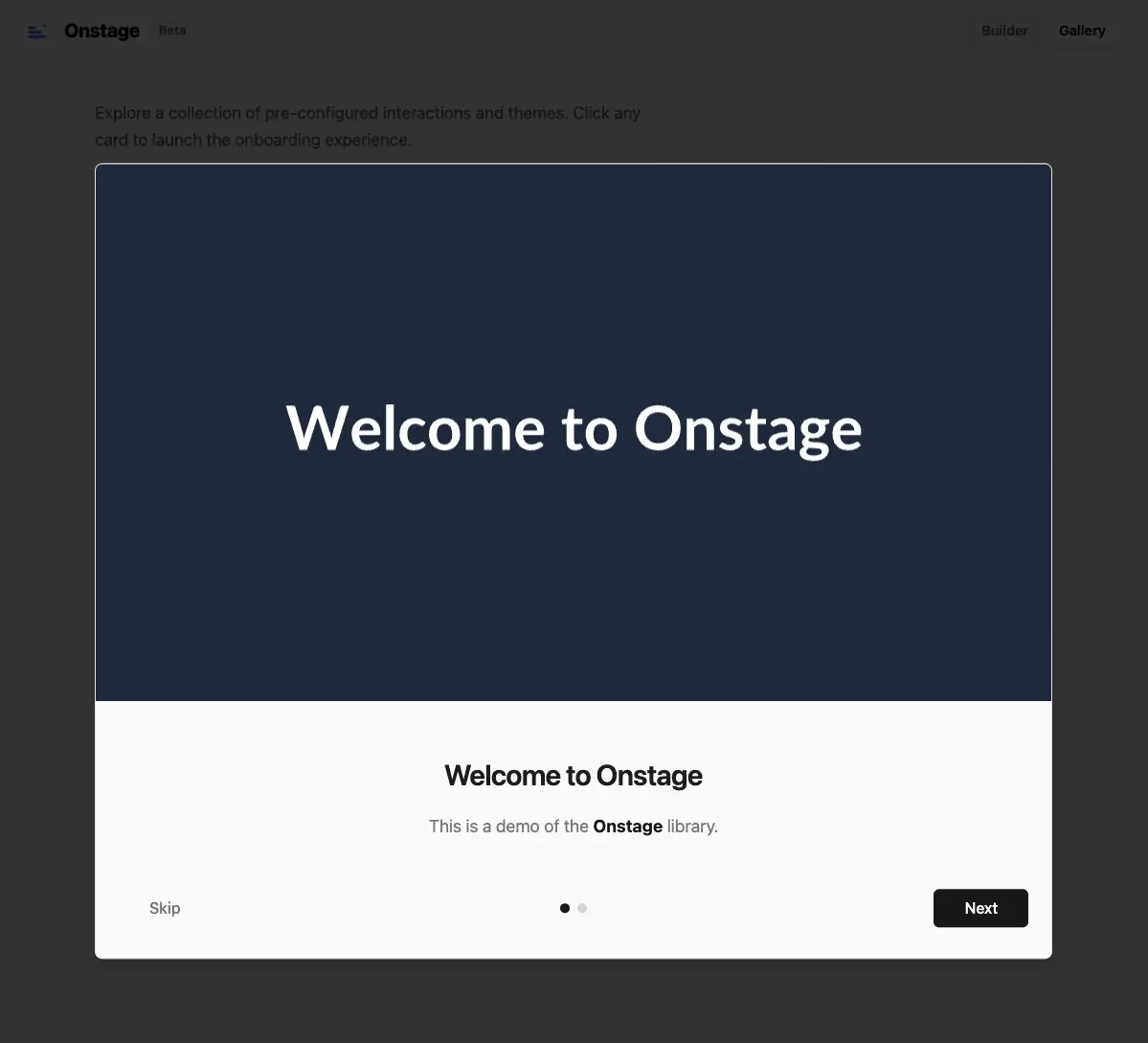
OnStage provides a beautiful, responsive, and fully customizable modal wizard with zero friction. It is designed to be "plug and play" while offering granular control for developers who need it.
Why OnStage?
Building a good onboarding experience from scratch is time-consuming. You have to handle:
- State management (is the modal open? which step is active?)
- Responsiveness (mobile vs. desktop layouts)
- Theming (dark mode, colors, fonts)
- Accessibility and keyboard navigation
OnStage solves this by providing a drop-in solution that looks premium out of the box.
Key Features
- 7 Pre-built Themes: Choose from "Glassmorphism", "Midnight", "Ocean", "Sunset", and more.
- Fully Responsive: Automatically adapts visuals for mobile (4:5), tablet (4:3), and desktop (16:9).
- Plug & Play: Just provide an array of steps.
- Flexible Control: "Strict" mode (forces completion) or "Permissive" mode.
- Granular Styling: Override any part of the UI with Tailwind or CSS variables.
- Interactive Builder: Design your modal visually and export the code.
How it Works
Integration is simple. Wrap your app with the provider and pass your steps.
import { OnboardingProvider, OnboardingModal } from "onstage";
import "onstage/styles.css";

const steps = [
  {
    title: "Welcome! 👋",
    description: "We are **thrilled** to have you here.",
    image: "/images/welcome-desktop.png"
  },
  {
    title: "Features",
    description: "Explore our new dashboard.",
    image: "/images/dashboard.png"
  }
];

export default function App() {
  return (
    <OnboardingProvider steps={steps} defaultOpen={true}>
      <YourApp />
      <OnboardingModal />
    </OnboardingProvider>
  );
}
Interactive Demo
I built a dedicated demo application to showcase the library's capabilities. You can:
- Try all themes in real-time.
- Customize colors, backdrops, and gradients.
- Export the configuration code directly to your project.
Check out the live demo to see it in action.